
Wednesday, 28 October 2015
Workshop: ZBrush 2
I had another ZBrush session today and we mostly just learned about a few more tools and techniques such as mirroring, the functions of the edit and draw modes and then a few different brushes. Like before, I struggled to remember most of what was taught to us partly because our tutor goes through things pretty quickly and I struggle to keep up, but mostly because there is a lot to remember in general and I simply cannot keep up. However, we had a lot more time this session to just play around with the program and to just quickly create something, which I went for a snake's head, which I am actually quite proud of as it is only the second time I have properly used the program and I feel that it actually came out pretty well.

Sunday, 25 October 2015
Week 5 Summary
I did more work this week then I have done in the last couple of weeks, and although I am behind a little bit, I did manage to finish the final piece of the timepiece project which I am proud of, although I feel it is weaker then my insect project simply because I did not enjoy the project as much. I've also begun creating some silhouettes for the new project, which revolves around choosing a character from the fairy tale "The Tinderbox", and designing them to fit into a time period which was allocated to us. I was allocated the Georgian Europe era, and although initially I really disliked this, it has grown on me overtime and I am looking forward to taking these further.
On Wednesday we had a different session to usual, and that was a group critical, where we each presented our timepiece work to the rest of the people in our group. When it came to mine, I sadly did not get much criticism, but I did get a few suggestions on how I could develop the floor plan layout of the snakes, which I took into consideration, especially when I was creating the final piece.
Thursday was simply another critical session with our project leader, although I did not get a chance to get feedback from our project leader. I did however manage to create my silhouettes for the character project which I am pleased about and I can now work solely on this project now that the timepiece has been finished apart from some blog parts.
This new project, despite me initially hating some parts of it, has easily become my favourite of three and I think I can create a much better outcome from this project as a result, providing I can catch up and not rush parts of this project.
Friday, 23 October 2015
BA1a (3): Silhouettes
This third and final mini-project is about characters, where we have to design a character from the fairy tale The Tinderbox. I was given the Georgian Europe time era in which to design my character from. I'm not too familiar with this time era so I started off by looking into various Georgian Europe clothes in order to get an idea on what they wore. I created a base female silhouette for the princess since this is the character I am most interested in working with. I duplicated the base female silhouette and then created various dress sizes for each one. I also created a silhouette for the dog and created two alternate ones for the dog, as well as a silhouette for the witch.
Below are the silhouettes that I took further from the ones I already made and designed further. I created a lot of these after looking at some Georgian dresses, and attempted to just get a Georgian feel onto the designs. I haven't added any details to the princess herself as I wanted to work on facial details, hair and jewellery on there own. The dog and the witch follow pretty similar routes, although they are also very uninspired and pretty lacklustre in my opinion since after finishing the princess silhouettes I was dead set on using those. The princess silhouettes that I am most interested in are the second and third ones from the top left and the second one from the bottom left, with second from bottom left giving me the most ideas.

I also created these silhouettes seen below, however I did not like any of these and didn't really want to take them further. The top left one however is the base female model that I used for all the other designs.

Thursday, 22 October 2015
Stone Wall and Floor Texturing
For my final timepiece I was unsure on how to texture a stone wall and floor and how to make it look convincing as my work on backgrounds was very minimal before. For the room for the snake to sit in, I wanted it to look old and minimalist, so a large and varying chunks of rock would suit it better then something like bricks. I settled on using a similar technique that I use on my characters and objects, and it turned out to work fairly well in my opinion, clearly being a stone wall.


Wall 1 - http://www.tonytextures.com/free-natural-stone-wall-texture-photo-gallery/
Wall 2 - http://www.tonytextures.com/free-natural-stone-wall-texture-photo-gallery/
Wall 3 - http://www.tonytextures.com/free-natural-stone-wall-texture-photo-gallery/?nggpage=2
Wall 4 - http://www.touchoftexture.com/stone_n_sand.html
In terms of the flooring, I wanted simple stone slabs that had some wear and tear to them, making them look a bit uneven. I created these by drawing something similar to a checkers board on the floor, and then going across the lines again but making sure the lines were uneven and jagged, and then finally adding lines over the remaining squares to give a cracked effect.

http://www.lapicida.com
BA1a (2): Final Piece
Before starting my final timepiece, I decided that I wanted to draw a few simple thumbnails to figure out how I would like my timepiece to look. Whilst I did previously state that I could have these snakes on a raised platform of some kind, I changed my idea for this because I simply just did not want to go with it and just wanted the pieces to be on the floor.
I had a basic idea of how I wanted my final piece to look so I worked with that and created three different looks. I shall be using the last thumbnail as a base template though because I feel that this is the strongest one and fits better for my timepiece since it revolves around the apocalypse, having an arched window gives the impression of a church or some kind of old building which will fit the theme better.
I had a basic idea of how I wanted my final piece to look so I worked with that and created three different looks. I shall be using the last thumbnail as a base template though because I feel that this is the strongest one and fits better for my timepiece since it revolves around the apocalypse, having an arched window gives the impression of a church or some kind of old building which will fit the theme better.

To start on the actual final piece itself, I started by using the line tool to draw lines to create the corner of the room, and then used the brush tool and begun drawing the window, snake and trench. I decided to only go with drawing one snake simply because it would be difficult to include all four of them with the square/diamond floor plan that I liked for them. The snake that I chose to draw was Pestilence from a mixture of being my favourite design and being the first Horseman of the Apocalypse. I tried out a few different designs for the window and will decide which one I shall use later on as I develop the background further.

I filled the entire image grey because I wanted a stone wall and floor. I wanted to work on the wall itself since it was the largest part I had to do. I had a look at a few stone walls so that I could get an idea on the different types of stone walls, and in the end settled on a wall with various stones scattered throughout it. I started this by drawing completely random outlines all across the walls, and then filling them all the same grey that I drew them with.

I added some black lines to give myself a guide as to where I should add shading to the rocks on the walls. To give myself a break from the walls I decided to colour the snake, which was simple enough to do by selecting the inside of the snake parts and filling with the respected colours. I then shaded the snake on a separate layer using the brush tool and setting it to black, then setting the layer itself to 50% opacity. I also lit the window sides using the same technique as the shading with the snake, only using a slightly yellow-white instead of black. I also shaded the trench at the bottom with the same technique but with a 30% layer opacity.

I then began adding shadows to the rocks by using the same technique that I have been using for most of this project, but with a 40% layer opacity, as well as shading underneath the rocks slightly with a 30% layer opacity. I also shaded the walls and floor with the same techniques. When it comes to the flooring, I wanted a stone tile flooring to match everything else. I did it by simply drawing in a dark grey, allowing the lines to be shaky in order to give the appearance of an uneven surface, then drawing smaller lines to create cracks.

At this point the image was practically finished, but I blurred the rocks in the background so they were not as defined and didn't draw attention away from the snake. The outside view was simple enough to create by filling the empty space blue, and then using a different brush which was faded around the edges and was almost blob-like. Using this brush, I painted some clouds, a mountain and some trees, leaving out a lot of detail so that it looked very distant.
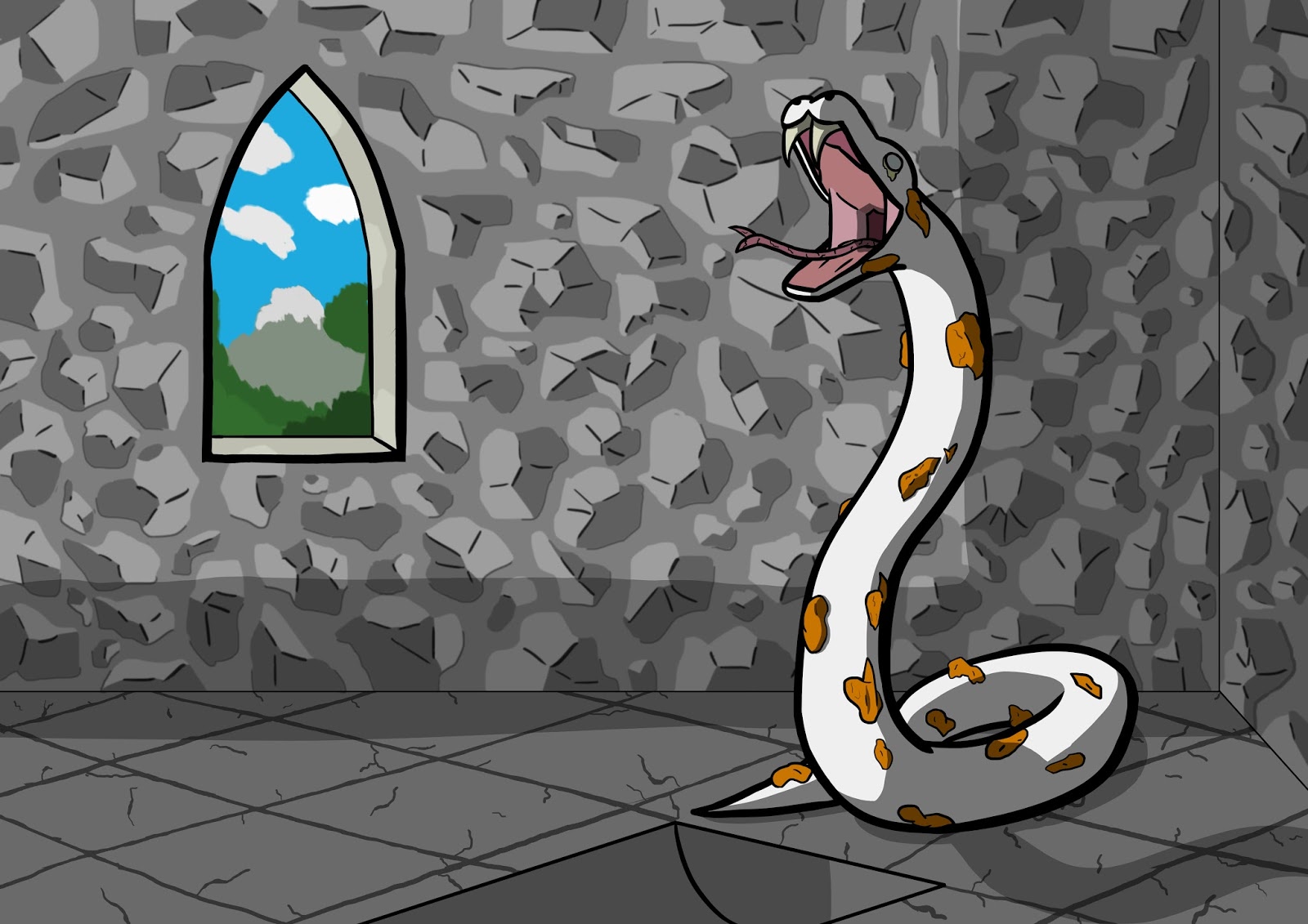
Above is my final timepiece artwork. I wanted a very dull and plain background that is entirely stone, something that looked ancient, and to contradict this I decided the outside world was to be bright, both to stand out and to contradict the inevitable apocalypse. In terms of how I organised the composition I tried to follow the rule of thirds to some degree just because I quite like that composition, however I did not follow it as much as in the previous insect project. Unintentionally the 'L' also appeared with the shadows creating attention for the window.
Tuesday, 20 October 2015
BA1a - Concept Art: Task 3
We received the third part of this concept art project, being similar to the previous mini projects, only that we have to create both a character sheet and a model sheet. For this mini project, we have to design a character from the Hans Christian Anderson fairy-tale called 'The Tinderbox', with a twist, as we have been allocated a time period which we should design our character to be from. I received Georgian Europe, which when looking for online images quickly of the clothing style featured a lot of large dresses and coats with frilly bits which I am honestly not a big fan of, but I can probably find something I like that I can work with.
When I read the fairy-tale, I noticed that there was actually only a handful of characters to actually pick from, but because so few details were listed about each one, they can easily be interpreted into anything really. Realising this, I could immediately think of a few ideas that I am definitely going to consider working with:
-Princess (rugged/feral/prisoner/demon/creature?)
-Dog with teacup eyes (robot/construct/demon?)
-Witch (princess in disguise/mythical creature in disguise?)
-Soldier (female in disguise/cyborg in some way?)
The story itself could be taken in many ways, such as seeing the soldier as an evil character, the king and queen as evil and mistreating their daughter, or even just the princess herself as evil, with her parents holding her prisoner and changing the story of why she is hidden in the castle so that she does not hurt anyone. There are various important points in the story that can be interpreted differently depending on the thoughts and views of the reader.
'The Tinderbox' read from here:
http://hca.gilead.org.il/tinderbx.html
Sunday, 18 October 2015
Week 4 Summary
This week I have admittedly done very little work, mainly because I just haven't got any strong ideas that I want to work with or really stand out to me, so have been struggling to get any further with the project. The beginning of the week ended up with me doing nothing, but then on Wednesday we had a life drawing session, and it gave me some motivation to begin creating some more concept art, although I still struggled to think of anything that really grasped my attention. The life drawing session was alright however, it followed a similar path to my previous session, but starting with the 16 short drawings and then going into some chalk drawings, where we was tasked to work on lighting instead of drawing lines to create the shape of the body.
On Thursday I had another review session with our project leader, and I was discussing this project with him and my ideas about the Apocalypse snakes and the woman with an hourglass body, and although he said to do the one that I wanted to do more/felt right, which was the hourglass woman, that this project is more about an object. He eventually told me that I should do the hourglass woman one if that is what will make me happier, but to just keep it more timepiece then human. Whilst I did want to go with the woman, I decided to stick with the snakes, as I had a more object design for them and I felt as though I would not be following the project properly if I was to stick with the hourglass idea. After speaking to him, my project leader showed me a few shortcuts on Photoshop and some ways that I could generate ideas, such as using squares, circles and triangles to create silhouettes. When I practiced this though, I could not see anything in what I was making so I stopped doing it and continued to draw some sketches and designs. When I got home, and for the rest of the week, I continued designing some snakes and eventually settled on some designs that I will use for my final piece, getting to the point that the model sheet is almost complete and the designs are pretty much settled upon now.
I haven't been enjoying this project as much as the previous one because I cannot think of anything I like, but I should have the project finished soon so that I can begin working on the new one, which we will receive the brief for tomorrow.
Saturday, 17 October 2015
BA1a (2): Model Sheet
To start my model sheet I took the same drawing of the snake that I created and duplicated it into a new document. In there I then duplicated it again and mirrored the image, tweaking the tail and tongue slightly look like the other side. I then added in all the lines to correspond with various points on the body, such as various parts of the head and various parts of the tail, so that I could line them up later when I begin drawing other angles.
Once I began drawing the front angle, I realised just how helpful these lines were, as I had never used them for previous drawings before. They were immensely helpful in making sure all proportions are the same and for lining up body parts and angles. Just because of how I have positioned the snake, it looks incredibly bland from below the head, however this will most likely be solved once I begin to add some shading to my design. The head was a lot more intricate and took a surprisingly long amount of time to do since the inside of the mouth has a lot of folds and muscles visible.

The back of the snake was a lot simpler to do as I pretty much just had to change some of the lines and remove the mouth details from the snake whilst adding a few different details.

I then added colour to each drawing, colouring them the four different colours I have used for the snakes, and then shaded them using the same techniques as with previous drawings. I did not add any of the specific features from each of the snakes as this would have taken too long to develop, as well as would not be ideal adding them to the snakes themselves. I also did not include the skull head of the Death snake because the majority had normal snake heads.


I then added colour to each drawing, colouring them the four different colours I have used for the snakes, and then shaded them using the same techniques as with previous drawings. I did not add any of the specific features from each of the snakes as this would have taken too long to develop, as well as would not be ideal adding them to the snakes themselves. I also did not include the skull head of the Death snake because the majority had normal snake heads.

Friday, 16 October 2015
BA1a (2): Designs
To begin creating a more final design, I created what would be the shape and positioning of the snake. I quickly drew it out in the bottom left hand corner, but decided I wanted something a lot smoother whilst still keeping this position. I redrew it, enlarged it, and duplicated it so I could begin working on some designs. After thinking about what it's design should be, I decided that I actually wanted to base it around the Four Horsemen of the Apocalypse, and that there could be four snakes, each one representing a horsemen, and once the snake was full then the corresponding horsemen was summoned.
After quickly looking into the horsemen I noticed that the first horsemen, commonly known as Pestilence, actually goes by another name in the Bible: Conquest. Taking this into account, I made sure I had five duplicates of the snake so I could create a design for each horsemen, and I can decide whether to use Pestilence or Conquest as the first horse after the designs are complete. When looking at each horsemen, I wanted to take into account any specific trait that that horsemen was associated with, or what the name of the horsemen itself is associated with. For example, War is noted to have a large sword, so I included that in it's design, as well as giving the snake armour and scars to show that it has been in warfare.

The designs for the snakes became pretty simple and fairly linear once I looked further into the horsemen, with little changes to them. In order to make it even easier to place a snake to a horsemen, I made sure each snake was coloured to match their horsemen (Pestilence/Conquest = white, War = red, Famine = black, Death = pale).
In the top left is the Pestilence snake, which I gave it the appearance of having a fungal disease that snakes can be infected with that causes their scales to thicken and become crusty with over raised blisters. I also made it's eyes pupil-less and coloured it to give it a cloudy or glazed effect, as well as having some kind of puss seeping from under the eye. I added cracks to the tongue and darkened the inside of it's mouth and tongue in order to give it an ill appearance.
To the right of this is the Conquest snake. Conquest was depicted as wearing a crown and wielding a bow and arrow, so I tried incorporating these into it's design. Whilst the bow was pretty difficult to add without it looking odd or a bit out of place, I made the arrow pierce the snake, and simply added the crown to it's head.
In the top right is the War snake. As previously stated, War is said to wield a large sword, so I added that to the design by placing it in between the snake. In order to give it a more war-like appearance, armour and scars were added to it to show it had been in conflict.
In the bottom centre is the Famine snake. I found this snake to be the trickiest to work with as it was a lot harder finding things to incorporate into the design. Famine is depicted as holding weighing scales, so I added them in by placing them on the snakes tongue. In order to give the impression of famine, I added a rotting apple to the design as well, and in the end also had to add some locust as I noticed that they link in with famine well.
Lastly is the Death snake. I felt this one had some fairly obvious design choices, so I replaced the head and partly the tail with a skeletal structure. Whilst Death itself is often associated with a scythe, I decided not to add it as it is not what Death actually had and I feel it would be too large and clumbersome. It originally did not wield any weapon or object and came in with Hades instead, but I could not find an easy way to add this into the design, so I instead added a simple black robe to tie in with what Death is more commonly depicted as.

I tried adding some lighting effects to the metal parts of the various designs by using the same technique as I did with the shadows, although I painted the areas with white instead of black, and then lowered the opacity. The final designs are below, and personally I am thinking to use Pestilence over Conquest, and that I should perhaps think about only using one of these in my final piece since it would save myself time as I am slightly behind.

I also decided to quickly design some floor plans showing where and how they would be sat in comparison to one another, as since there are multiples it only makes sense.
The idea is is that a liquid begins pouring into the snakes' mouths very slowly over time, and once their mouths start overflowing, the excess liquid pours down into a small trench that leads to a large bowl, and once that is filled, a portal is created and the corresponding horsemen is then summoned. The snakes would fill at different rates in order to keep to their order of arrival (so Pestilence/Conquest, War, Famine and then Death).
The first design is a simple circle with the snakes dotted around it evenly, with trenches leading from the front of each of them and ending at a large central bowl.
The second design is the four snakes sat in a line, with the bowl sat in front of them all.
The final design is similar to the first, only sat in a diamond formation.
My favourite would have to be the diamond design as it would looks a bit smoother and I have an easier time imagining it standing out from it's surroundings (like on some kind of raised stone platform) as opposed to the other two.

Wednesday, 14 October 2015
Workshop: Life Drawing 2
My second life drawing session followed a pretty similar routine to the previous sessions, only having the shorter drawings at the beginning and then two longer drawings at the end. This session probably could of gone a bit better for me because I still did not really finish any of the drawings, but then again it was still only my second life drawing session.
This was the drawing from my first mini session, which we were just asked to do a 12 minute drawing of the life model using whatever materials we wanted. I decided to go with the basic pencil since that is what I prefer and what I am used to. I took my time with drawing and it definitely shows in the drawing as there is very little detail.
These first few drawings were simple line drawings with a pencil, having to do them in 4 minute and 3 minute intervals.
These first few drawings were simple line drawings with a pencil, having to do them in 4 minute and 3 minute intervals.

This next set followed us having 2 or 3 minutes to draw the model, and then another 2 or 3 minutes to shade the drawing. I managed to get a lot more done in these time slots, have gotten a large portion of the body done in almost all of the sketches.

These next two sketches were done over the course of 12 minutes each, where instead of drawing lines around the body, we used chalk to sketch out any lit up areas of the body, as doing this will allow us to create interesting images whilst still creating an obvious human figure. This was an interesting way of drawing but I feel that these drawings turned fairly well, especially the first drawing. I had never drawn in chalk before so this was a nice material to work with. A slightly different property it has compared to a pencil is that you can smudge it easily but it does not end up looking messy, like what tends to happen with a pencil, so I started trying that out in the second image.


Tuesday, 13 October 2015
Timepiece References and Inspiration
When creating some concept designs and ideas for my time piece I used a few different references to help me.
For the hourglass woman/robot, I simply looked at the hourglass body shape, and then tried incorporating an actual hourglass into this, which was fairly simple to do. Beyond this though I did not really have any ideas for this woman, and started off with ball jointed limbs to make her definitely look more robotic.
When it comes to the base snake designs, such as the more blocky body, I looked at some Mayan snake designs, specifically the ones shown below. I wanted to experiment with different designs to see what could work best to contain whatever liquid is poured into the snake, and in the end I went for just a natural snake design.


First Mayan snake - http://www.arden.com/theartifact/aprecol1/
Second Mayan snake - https://rfclipart.com/the-mayan-snake-6265-vector-clipart.html
Third Mayan snake - https://www.flickr.com/photos/gwendalcentrifugue/5304668316
Fourth Mayan snake - http://intrepidberkeleyexplorer.com/Page17J.html
Snake skull - http://bestiarumosteo.blogspot.co.uk/2015/02/toothy-snakes.html
Snake mouth 1 - https://tr.fotolia.com/id/35039798
Snake mouth 2 - http://riverbankoftruth.com/2014/06/21/in-the-jaws-of-the-great-serpent-by-greg-calise/
Snake Fungal Disease - http://www.livescience.com/48725-photos-snake-fungal-disease.html
The Four Horsemen of the Apocalypse greatly inspired my snake's designs, inspiring the more unique traits between them and also inspiring the colour schemes to match the horses, as each snake is meant to summon the respective Horsemen once it is filled.

Image Reference - https://en.wikipedia.org/wiki/Four_Horsemen_of_the_Apocalypse
For the hourglass woman/robot, I simply looked at the hourglass body shape, and then tried incorporating an actual hourglass into this, which was fairly simple to do. Beyond this though I did not really have any ideas for this woman, and started off with ball jointed limbs to make her definitely look more robotic.
When it comes to the base snake designs, such as the more blocky body, I looked at some Mayan snake designs, specifically the ones shown below. I wanted to experiment with different designs to see what could work best to contain whatever liquid is poured into the snake, and in the end I went for just a natural snake design.


I also needed to look at some snakes with their mouths open since I was struggling to draw an open mouth without it looking off, with the two images below being what I used as reference.


For the Death snake I also needed to look at a snake skull because I have little knowledge of the construction of a snake's skeletal system. Despite snake skulls varying slightly depending on the subspecies, looking at a couple of different types of snake's skulls gave me a rough idea on how to create it.

For the Pestilence snake, I looked into snake diseases that I could incorporate into it's design in order for it to relate to the Horseman of the Apocalypse with the same name. I ended up finding the website listed just below, which details various snake diseases and illnesses. In the end I integrated eye infections and fungal diseases into the Pestilence snake's design since they gave the most obvious signs of illness.
http://www.cornsnake.co.uk/snake-diseases.php

First Mayan snake - http://www.arden.com/theartifact/aprecol1/
Second Mayan snake - https://rfclipart.com/the-mayan-snake-6265-vector-clipart.html
Third Mayan snake - https://www.flickr.com/photos/gwendalcentrifugue/5304668316
Fourth Mayan snake - http://intrepidberkeleyexplorer.com/Page17J.html
Snake skull - http://bestiarumosteo.blogspot.co.uk/2015/02/toothy-snakes.html
Snake mouth 1 - https://tr.fotolia.com/id/35039798
Snake mouth 2 - http://riverbankoftruth.com/2014/06/21/in-the-jaws-of-the-great-serpent-by-greg-calise/
Snake Fungal Disease - http://www.livescience.com/48725-photos-snake-fungal-disease.html
The Four Horsemen of the Apocalypse greatly inspired my snake's designs, inspiring the more unique traits between them and also inspiring the colour schemes to match the horses, as each snake is meant to summon the respective Horsemen once it is filled.

Image Reference - https://en.wikipedia.org/wiki/Four_Horsemen_of_the_Apocalypse
Monday, 12 October 2015
BA1a (2): Brainstorming
Over the weekend and whilst trying to elaborate on more ideas, I thought of another idea which I could work upon (more on that later). However, I am going to continue working on my previous ideas since I feel these are stronger ideas.
I wanted to work on the design for a woman with a literal hourglass figure, so I began drawing up some designs, working on some simple hairstyles and body parts. My tutor showed me a way that I could generate ideas by simply using squares, triangles and circles, although I felt that this does not help me a lot to be honest. A problem I have been having is that I haven't managed to nail down a concept I really like, nothing has really screamed out to me as something I really want to work on.

 I thought I should try out my newer idea as this previous idea was not really going anywhere, which I thought of over the weekend. This new idea was to have a snake that would have something pour into it, slowly filling it up. The inside of the snake would be segmented, and once a bit was full another bit would open up. Each segment would equate to a part of an apocalypse or some similar event, my main idea being that it would release a horseman of the apocalypse. I originally thought of using a more realistic snake design, but also wanted to try out a Mayan snake design, so I created some more blocky and angular shapes, although I prefer the more realistic look since it would work better for the liquid that would pour into it.
 Despite my initial thoughts about this design I am actually starting to prefer it over the woman and I feel that it would be easier to work with as well. As I spoke to my tutor, my thoughts about the idea of creating this robotic woman started diminishing as I realised it was not something I should be doing because the timepiece should be an object.
I wanted to work on the design for a woman with a literal hourglass figure, so I began drawing up some designs, working on some simple hairstyles and body parts. My tutor showed me a way that I could generate ideas by simply using squares, triangles and circles, although I felt that this does not help me a lot to be honest. A problem I have been having is that I haven't managed to nail down a concept I really like, nothing has really screamed out to me as something I really want to work on.


Sunday, 11 October 2015
Week 3 Summary
The third week has been a lot busier then previous weeks, mainly because I have not managed my time too well and still had to finish the final piece for the insect part of the project as well as some bits on this blog, so I did not start the timepiece part of the project until Thursday when I had a critique session with our project leader. During this session though I managed to create a variety of silhouettes and even started adding some detail to some of them, however I am finding this mini project already a lot harder because I am struggling to think of anything that could really work or hasn't already been done.
On the Wednesday we had our first ZBrush tutorial, and although the program is very intricate and diverse in what can be created in it, I struggled to take in everything we learnt, but I'm sure that if I practice using it then I could get the hang of how it works. One of the more annoying things about the program is controlling the camera, although this is most likely just a personal annoyance as I seem to be the only one to struggle with it.
In my own time I did finish off the initial designs for my silhouettes, and there are a few that are interesting to me, however the only strong ideas I can think of are character designs of the following:
-A woman with a literal hourglass figure.
-A man/machine made entirely out of timepieces, such as a sundial shield/pocket watch flail, a clock for a hat, grandfather clock shape + colour scheme.
These two could easily be mixed together which I am definitely considering, although right now the hourglass figure idea is the most appealing on to me.
Wednesday, 7 October 2015
Contextual Studies: Characters Throughout Video Game History
Our second task was to look at the importance of characters by looking at an iconic character in each decade and explaining why they are important.
1970s: Space Invaders
Whilst not a specific character themselves, the Space Invader aliens are one of the most iconic things in video gaming, and the video game itself was a forerunner of modern video gaming, helping to expand it from a novelty to a global industry, and the game's success has been credited as causing the end of the video game crash of 1977. They feature distinct appearances that really stand out despite being blocky and pixelated.
 http://io9.com/space-invaders-movie-will-make-shooting-at-rows-of-pixe-1607482091
http://www.next-gen.biz/features/30-defining-moments-gaming
Whittaker, Jason (2004). The Cyberspace Handbook. Routledge. p. 122. ISBN 0-415-16835-X. [55]
1980s: Duck Hunt Dog
The dog featured in the NES game Duck Hunt, became iconic purely because of it's laugh. Usually the duck would retrieve any ducks you shoot, but whenever the player would miss any of the ducks on screen, the dog would appear from behind the grass and begin taunting and laughing at the player. This alone has labelled the dog as both one of the most annoying characters of all time by IGN and ScrewAttack, and as one of the best dogs in video gaming history because of his smugness. 1UP.com also praised the dog's confidence in their Top 10 Video Game Dogs list for "laughing at a frustrated human with a loaded rifle".
 http://www.technobuffalo.com/2015/05/11/teens-play-duck-hunt-for-the-first-time-hate-the-dog-as-much-as-we-did/
http://uk.ign.com/articles/2008/06/23/acd-duck-hunt-dog
http://www.1up.com/features/top-10-video-game-dogs
1990s: Mewtwo
Coming from the very first Pokemon games, Mewtwo was seen as the final boss or challenge after completing the story and Pokemon League. In the original games, Mewtwo is found inside a cave only accessible after completing the Pokemon League, and has in-game statistics that were unmatched by any other Pokemon, making it the strongest Pokemon at that time. Mewtwo's typing, Psychic, was also incredibly broken at the time, with only one weakness (it being Bug, which only had 4 attacks at the time, all of which were incredibly weak, as well as Bug types themselves being lack lustre in stats and having a lot of weaknesses) and usually having access to a wide range of attacks that allowed them to cover a lot of types. Mewtwo itself had access to this wide movepool, could only be out-sped by one other Pokemon, and had the highest Special stat in the game (Special stat being used to determine how much damage that Pokemon can deal and receive from special moves, these being what Mewtwo's movepool mostly featured). Because of all this, there was very little that could stop Mewtwo, so was feared by anyone who had to fight one and became the main goal to catch for anyone who could battle with their friends. It was also considered the first 'true' legendary due to his stats and presence in the games.
Its popularity and iconic stance only grew with the first Pokemon film, which detailed its backstory. Mewtwo was a genetically altered clone of the Pokemon Mew, created to be the most powerful Pokemon. It broke out of it's tank and realised it was just an experiment, resulting in it decimating the laboratory and killing all the scientists in the process (the only Pokemon in the series to have killed people). It is then discovered by the leader of the villianous team Team Rocket, and throughout the rest of the film it is frequently shown to easily stop any Pokemon in its path. Mewtwo's strength and tragic backstory made it become even more iconic then the games already had.
 https://www.youtube.com/watch?v=Hj9tk36HZJk
Pokemon Red and Blue
Pokemon: The First Movie: Mewtwo Strikes Back
2000s: Master Chief
Master Chief is a huge icon in the video gaming industry, essentially being to Xbox what Mario is to Nintendo. Master Chief is a cold, almost completely silent protagonist that is designed to look and act like the perfect futuristic super soldier. Part of his iconic position is that no one knows what he looks like under the SPARTAN suit, essentially allowing the player to full submerge themselves into the story and experiences within the games, but also has an in-depth backstory that defines Master Chief as a character. Halo: Combat Evolved (the first game in the Halo franchise, which is where Master Chief comes from) became so popular that half of the original Xboxes were sold alongside a copy of the game, and Master Chief was the main character in this game, listed as one of the most important and influential console shooters ever made.
 https://gamesrewired.wordpress.com/2014/03/31/halo-combat-evolved-2001/
http://uk.ign.com/videos/2015/10/22/ign-icons-master-chief?utm_campaign=ign+main+twitter&utm_source=twitter&utm_medium=social
2010s: Inklings
Again whilst not a specific character itself and are more iconic for Nintendo, the Inklings are a very recent addition to video gaming. The Inklings are from the video game Splatoon, which is a brand new IP for Nintendo (which are often consider rare already) and is a completely different take on what they normally create (Splatoon being a third-person shooter, as opposed to platformers and RPGs, which is what Nintendo frequently create). The Inklings themselves are unique in design in that they are in a future where the world has flooded and sea life is now dominant, with squids evolving into humanoid forms that can freely transform back into squids. Unlike most shooters, Splatoon doesn't revolve around killing and bullets, but rather it uses ink and oddities for weapons, such as paint rollers, paint brushes, guns that resemble plastic water pistols, spray guns, pipettes, pens and even NES Zappers (the same guns used to play Duck Hunt), with the main in-game mode revolving around covering the map with more of your ink then your opponent (ink relating to squids because of the ink they can produce). The Inklings represent a unique take on a gaming franchise and have since become a semi-iconic staple for Nintendo with a new branch of games.

https://www.washingtonpost.com/news/comic-riffs/wp/2015/05/27/paintball-for-turf-with-all-ages-splatoon-slinging-vivid-paint-means-having-a-ball/
Splatoon
Iconic characters are becoming harder and harder to come across as video games continue to be made. In the 70s and 80s, few games were made, few ideas were taken and graphics were limited so characters were a lot simpler. These characters also add a lot more nostalgia for gamers because it is what they grew up with. As time has gone on, ideas and designs have needed to be pushed (although this does not mean early games were not creative) in order for things to become more iconic and stand out, as well as the characters not having enough time to truly become iconic staples. Characters such as Mario, Lara Croft, Master Chief, Pac Man and Pikachu have already set the iconic status for themselves and makes it so they cannot be removed from this status, so places for a character to become iconic in more recent years has mostly diminished.
1970s: Space Invaders
Whilst not a specific character themselves, the Space Invader aliens are one of the most iconic things in video gaming, and the video game itself was a forerunner of modern video gaming, helping to expand it from a novelty to a global industry, and the game's success has been credited as causing the end of the video game crash of 1977. They feature distinct appearances that really stand out despite being blocky and pixelated.

http://www.next-gen.biz/features/30-defining-moments-gaming
Whittaker, Jason (2004). The Cyberspace Handbook. Routledge. p. 122. ISBN 0-415-16835-X. [55]
1980s: Duck Hunt Dog
The dog featured in the NES game Duck Hunt, became iconic purely because of it's laugh. Usually the duck would retrieve any ducks you shoot, but whenever the player would miss any of the ducks on screen, the dog would appear from behind the grass and begin taunting and laughing at the player. This alone has labelled the dog as both one of the most annoying characters of all time by IGN and ScrewAttack, and as one of the best dogs in video gaming history because of his smugness. 1UP.com also praised the dog's confidence in their Top 10 Video Game Dogs list for "laughing at a frustrated human with a loaded rifle".

http://uk.ign.com/articles/2008/06/23/acd-duck-hunt-dog
http://www.1up.com/features/top-10-video-game-dogs
1990s: Mewtwo
Coming from the very first Pokemon games, Mewtwo was seen as the final boss or challenge after completing the story and Pokemon League. In the original games, Mewtwo is found inside a cave only accessible after completing the Pokemon League, and has in-game statistics that were unmatched by any other Pokemon, making it the strongest Pokemon at that time. Mewtwo's typing, Psychic, was also incredibly broken at the time, with only one weakness (it being Bug, which only had 4 attacks at the time, all of which were incredibly weak, as well as Bug types themselves being lack lustre in stats and having a lot of weaknesses) and usually having access to a wide range of attacks that allowed them to cover a lot of types. Mewtwo itself had access to this wide movepool, could only be out-sped by one other Pokemon, and had the highest Special stat in the game (Special stat being used to determine how much damage that Pokemon can deal and receive from special moves, these being what Mewtwo's movepool mostly featured). Because of all this, there was very little that could stop Mewtwo, so was feared by anyone who had to fight one and became the main goal to catch for anyone who could battle with their friends. It was also considered the first 'true' legendary due to his stats and presence in the games.
Its popularity and iconic stance only grew with the first Pokemon film, which detailed its backstory. Mewtwo was a genetically altered clone of the Pokemon Mew, created to be the most powerful Pokemon. It broke out of it's tank and realised it was just an experiment, resulting in it decimating the laboratory and killing all the scientists in the process (the only Pokemon in the series to have killed people). It is then discovered by the leader of the villianous team Team Rocket, and throughout the rest of the film it is frequently shown to easily stop any Pokemon in its path. Mewtwo's strength and tragic backstory made it become even more iconic then the games already had.

Pokemon Red and Blue
Pokemon: The First Movie: Mewtwo Strikes Back
2000s: Master Chief
Master Chief is a huge icon in the video gaming industry, essentially being to Xbox what Mario is to Nintendo. Master Chief is a cold, almost completely silent protagonist that is designed to look and act like the perfect futuristic super soldier. Part of his iconic position is that no one knows what he looks like under the SPARTAN suit, essentially allowing the player to full submerge themselves into the story and experiences within the games, but also has an in-depth backstory that defines Master Chief as a character. Halo: Combat Evolved (the first game in the Halo franchise, which is where Master Chief comes from) became so popular that half of the original Xboxes were sold alongside a copy of the game, and Master Chief was the main character in this game, listed as one of the most important and influential console shooters ever made.

http://uk.ign.com/videos/2015/10/22/ign-icons-master-chief?utm_campaign=ign+main+twitter&utm_source=twitter&utm_medium=social
2010s: Inklings
Again whilst not a specific character itself and are more iconic for Nintendo, the Inklings are a very recent addition to video gaming. The Inklings are from the video game Splatoon, which is a brand new IP for Nintendo (which are often consider rare already) and is a completely different take on what they normally create (Splatoon being a third-person shooter, as opposed to platformers and RPGs, which is what Nintendo frequently create). The Inklings themselves are unique in design in that they are in a future where the world has flooded and sea life is now dominant, with squids evolving into humanoid forms that can freely transform back into squids. Unlike most shooters, Splatoon doesn't revolve around killing and bullets, but rather it uses ink and oddities for weapons, such as paint rollers, paint brushes, guns that resemble plastic water pistols, spray guns, pipettes, pens and even NES Zappers (the same guns used to play Duck Hunt), with the main in-game mode revolving around covering the map with more of your ink then your opponent (ink relating to squids because of the ink they can produce). The Inklings represent a unique take on a gaming franchise and have since become a semi-iconic staple for Nintendo with a new branch of games.

https://www.washingtonpost.com/news/comic-riffs/wp/2015/05/27/paintball-for-turf-with-all-ages-splatoon-slinging-vivid-paint-means-having-a-ball/
Splatoon
Iconic characters are becoming harder and harder to come across as video games continue to be made. In the 70s and 80s, few games were made, few ideas were taken and graphics were limited so characters were a lot simpler. These characters also add a lot more nostalgia for gamers because it is what they grew up with. As time has gone on, ideas and designs have needed to be pushed (although this does not mean early games were not creative) in order for things to become more iconic and stand out, as well as the characters not having enough time to truly become iconic staples. Characters such as Mario, Lara Croft, Master Chief, Pac Man and Pikachu have already set the iconic status for themselves and makes it so they cannot be removed from this status, so places for a character to become iconic in more recent years has mostly diminished.
Workshop: ZBrush
Today I had a workshop focusing on the 3D modelling program known as ZBrush, which is an incredibly interesting program. Although we learnt the basics of it, there is an awful lot to remember and I have already forgotten some of the more technical aspects of it such as the effects of the various brushes and some of the alternative ways to create 3D models and structures. However, I have learnt what the most necessary brushes are and what their effects are, as well as the commands to give them different effects and the fact that holding the ctrl key whilst hovering the mouse over a tool will give you some information about that tool, so I have enough knowledge to know how to start sculpting in a future session. However, I have tried Sculptris before, which is a similar 3D modelling program, and I do not like using 3D modelling programmes simply because I hate how it controls when you try to rotate the camera. Although it is a minor thing, it has always bugged me. Despite this, I do want to learn how to use ZBrush and to improve my skills in it as I am aware of how important the program is when it comes to concept art, as it is an essential tool for designing and creating characters and creatures.
Tuesday, 6 October 2015
BA1a (2): Silhouettes and Initial Designs
This second mini project revolves around timepieces, and just like before I created a small group of simple silhouettes in Photoshop. These were even simpler then before as I had absolutely no idea what sort of thing to make, where as with an insect there is a general build to the body that I could follow. Again I did not use any images or objects as inspiration for my silhouettes so that I did not replicate anything already existing.
 I struggled to think of many shapes that could actually look like an ideal shape for a timepiece, but looking at these some of them do look like other things, such as the top left looking like a mushroom cloud, top right looks like peas in a pod, and the one next to bottom right looks like a salt and pepper shaker or a chess piece. These could all be interesting concepts that I could work with as a final design.
These are the initial designs I have come up with for my timepiece. Some of them were very uninspired simply because I could not think of anything do to with them. My favourite ones are definitely the bottom centre one, the one to the right of that and the bottom left one. The bottom centre is meant to be a woman with an actual hourglass in her torso, which is something I really like the idea of as it seems really unique. The one next to it that I like is meant to be a statue of a person crying into a bowl or something, which I thought could be an apocalyptic piece counting down to the apocalypse or something similar. The bottom left is something similar, but the sand or water moves down each segment of the insect for each part of the apocalypse.
Although I had some ideas with the one resembling a mushroom cloud, for a timepiece I could not think of anything beyond a simple hourglass-like system which has since been overshadowed by some of the other designs.

Monday, 5 October 2015
BA1a - Concept Art: Task 2
Today we was emailed the second part of this concept art project, it being incredibly similar to the previous mini project with the insect, only we have to design an instrument that measures time, like a watch. I'm not as excited for this mini project as the previous insect one, but that is purely because I prefer designing creatures and characters as opposed to objects. The task is to design something that is both visually impressive and creative, requiring everything that the previous mini project needed, so silhouettes, iteration and a final colour concept painting, but instead of having a character sheet, we have a model sheet instead which is simply just the object from different angles.
I quickly looked at a variety of different clocks available, and stumbled upon a list of them on Wikipedia:
 Immediately, the ones that take my interest at the doll's head clock, skeleton clock, hourglass, oil-lamp clock, sundials, projection clocks, pendulum clocks and incense clocks, although I shall develop my silhouettes first before looking at these so that I do not settle on one idea.
Wikipedia page: https://en.wikipedia.org/wiki/Clock#Specific_types_of_clocks
I quickly looked at a variety of different clocks available, and stumbled upon a list of them on Wikipedia:

Wikipedia page: https://en.wikipedia.org/wiki/Clock#Specific_types_of_clocks
Sunday, 4 October 2015
Week 2 Summary
The second week has been a bit calmer compared to the first week. We had a lecture on Monday with our tutor explaining different terms for lighting in imagery and various different compositional styles, which will be incredibly helpful for when I work on the final piece for this part of the project. We also had another lecture with another tutor on Thursday, who spoke to us more about the written and research parts of our work, which was very informative and will be of great help in both how I go about research and what sort of things I should research. The work I have done however is a lot less then compared to last week, and whilst I have almost finished my final piece for this insect work, it is still not finished, which ideally should have been finished this week so that we can move onto the next mini project, so from here on I will have to work a lot harder in order to catch up.
Saturday, 3 October 2015
Contextual Studies: Caillois Classification Grid
As part of our first representation lecture, we learned about Johan Huizinga's book Homo Ludens and how it is an important part of the history of game studies, influencing the work of Roger Caillois and his book called 'Man, Play and Games', which created a classification system for games. This classification features two types of play:
In order to get a fuller understanding of this classification system, we were tasked with creating a grid of some of our favourite games and compiling them into the classification system Roger Caillois created. Roger Caillois' classification system has a heavy impact on video games as every single game falls into one of the four categories. However, it is not to be ignored that a lot of games fit under several categories, and sometimes gets to the point where you have to name the category it does not come under. Video games feature so many aspects that they simply fit into most or even all of the categories, however minor it may be.

Good source of information: http://nideffer.net/classes/270-08/week_01_intro/Caillois.pdf
http://art.yale.edu/file_columns/0000/1474/homo_ludens_johan_huizinga_routledge_1949_.pdf
- Paedia, play without rules and spontaneous; uncontrolled fantasy.
- Ludus, regulated by rules which can be complex or limiting; requiring large amounts of skill, patience, effort and/or ingenuity.
And four forms of play:
- Agon, or competition, are competitive games based on rivalry and show the winner as superior to the loser in a certain way.
- Alea, or chance, are games that focus on chance and have an outcome that the players have no or little control over.
- Mimicry, or role-playing, are games that revolve around playing as an alternative being or character.
- Ilinx, or vertigo, are games that pursue vertigo and attempt "to momentarily destroy the stability of perception and inflict a kind of voluptuous panic upon an otherwise lucid mind".
In order to get a fuller understanding of this classification system, we were tasked with creating a grid of some of our favourite games and compiling them into the classification system Roger Caillois created. Roger Caillois' classification system has a heavy impact on video games as every single game falls into one of the four categories. However, it is not to be ignored that a lot of games fit under several categories, and sometimes gets to the point where you have to name the category it does not come under. Video games feature so many aspects that they simply fit into most or even all of the categories, however minor it may be.

Good source of information: http://nideffer.net/classes/270-08/week_01_intro/Caillois.pdf
http://art.yale.edu/file_columns/0000/1474/homo_ludens_johan_huizinga_routledge_1949_.pdf
BA1a (1): Final Piece
I had a rough idea on how I wanted my final piece to look, and because the forest version of my insect is meant to be the original species it only makes sense for it to be set in a forest. However, because this species is used in warfare, I want it to have a desolate setting, so I plan to make it foggy to some degree, as well as possibly add in one of the subspecies.
My experience of background and landscape design is very minimal so I just started off by drawing the shapes for the trees. I wanted to have a rock in the image so that I could position the main insect on it and to make that point stand out from the rest of the image. I split the image roughly in half and filled one half brown whilst the top half is a light blue, although this will be changed later on for a white or grey so it looks more like fog.

I created about five separate layers for the trees, each layer holding a line of them at different distances, so that I can add a layer of depth to the image. To further enhance this, I plan to add make the front set of trees more detailed whilst also retaining their black outline, whilst the trees further behind will lose the black outlines, whilst also becoming more and more blurred as well as having a white or grey gradient placed over the top of them to match the foggy theme, which will give off a desolate or abandoned feel to the image.

I slowly started to texture the trees, which I simply started painting lines in both slightly light and dark colours then the trees themselves. As my art style is quite cartoony, I looked at the television show Steven Universe for some references as to how they textures their trees.

I planned to have some light moss scattered on some of the trees so I experimented with various brushes to see what would work best. However, in the end this was never used.

I changed the background colour to a light grey to give off a better foggy effect, and then began adding a slightly grey coat to each layer containing trees, changing the layer opacity slightly for each one to give a better sense of depth. I also shaded the rock by painting black areas onto a separate layer and then lower the opacity of the layer to 30%. I also added a few more lines to the inside of it to give it more shape.

I decided to weaken the opacity of some of the further away tree layers as I thought this would look a lot better. I also added some more leaves to the ground and began adding grass in as well using a brush that resembled grass. I shaded the trees in exactly the same way that I did with the rock, except I changed the strength of the opacity to make it look better on the further away trees.

I added a small gradient towards the top of the ground so that it gave a better suggestion of fog, which I felt has been portrayed well because of this. At this point the image was pretty much done now, so I began drawing in my insect. I wanted it to look innocent and curious about it's surroundings, so I made it appear as if it was peering over the edge of the rock. However, I felt that having one of my insect in the image would not be enough because of it's size, so I decided to draw another one just climbing over the edge of the rock, whilst the severed head of one lay in front of the rock in order to continue hinting towards a desolate feel to the image.

The only thing left to do after this was to shade the insects and shade the rock a little more so that they looked more like they were on the rock.

Just above this is the final artwork I created for my insect in their habitat. As mentioned previously I wanted a desolate feeling to the image due to the warfare, and I feel that the fog captures this well. The small amount of my insects being there portrays this further due to how big the landscape is in comparison to how small they are. Having looked into lighting and compositions recently, I tried to use at least on of each of those effects in my piece. When it comes to the composition, I went for the 'L' composition by trying to have the tree line and the closest tree on the right create the L border around the rock, where I wanted the most attention because that is where my insects are.
Subscribe to:
Comments (Atom)