Monday 28 September 2015

Research: Lighting and Composition

During our light/composition lecture, we was tasked with analysing a few images and discussing some of the terms we learned about during the lecture.

Composition terms:
  • Divine Proportions
  • Rule of Thirds
  • "L"
  • Cross
  • Iconic

Lighting terms:
  • Absorption 
  • Reflection
  • Diffused Reflection
  • Refraction
  • Bounced Light
Shadow terms:
  • Dynamic Occlusion 
  • Sub-Surface Scattering
Composition
From this image you can see that it makes rough use of the iconic composition layout, where the four characters sit almost perfectly within the diamond. The two central characters almost sit perfectly along the central line as well. When looking at the iconic layout, if you divide the page into four triangles, then the three female characters and the guitar each get there own triangle, whilst the boy sits directly in the centre, suggesting that he is the main character (which he is the main character in the franchise). The image also roughly follows the rule of thirds, but in a slightly different sense, as the three female characters each sit in a different column, whilst the boy's arms sit on the dividing lines.


Looking at this image, it was developed with the cross composition layout, but with a slightly different take on it. If you divide the image along the vertical line, the left hand side focuses a lot more on the purple, where as the right focuses on the greens and lighter colours in general. If you split the image along the horizontal line, the top half focuses on dark colours on light colours, where as it is the opposite along the bottom of the image. If you split the image into a 5 x 5 grid, then the two characters' faces sit right in points where lines cross, more specifically their eyes. The character on the right also has other parts of them sitting in points where the lines cross, like their arm, foot and tip of the 'hair' (a tentacle in the game, since the character on the right can freely shape shift into the character on the left). This grid also allows the two characters to sit perfectly in a 2x5 grid.

Lighting
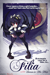
In this image you can see dynamic occlusion occurring on the central character, where the light has not diffused causing harsh shadows on both herself and the floor, suggesting the light source has much more directed light.

Some mild bounced light is evident in this picture with the floor being lit up despite the light coming from underground or below the characters. Some light is also being reflected from the weaponry and armour.

Sunday 27 September 2015

Week 1 Summary

My first week at the NUA, like when you start anything new, was kind of scary and a little bit daunting, but it went pretty well in the long run. Our lecture on Tuesday focused on just introducing us to the course and to higher education, as well as covering our first project and what we should create in terms of how character sheets and model sheets should look. Throughout the week I also had a life drawing session and a tutorial on Photoshop and Alchemy which should all aid me in developing my skills, although the life drawing will not aid me on this project, at least for now. In my spare time in the week I started developing my insect design to the point that I am almost at the final design, although I still do have a fair amount to do, but am pleased with my progress so far. I wanted to make my insect odd in order to try and create something unique from other designs, so I began thinking of what sort of things I could incorporate into an insect's design, and ended up making a list in a small journal:

-Hats, as shells/'homes'
-Foods, as shells/general body shapes
-Insect fusions

Whilst not a lot here, these three ideas alone have such a wide range of options that I could easily find something in at least one of them that works well.

Saturday 26 September 2015

Insect and Bird Flight Research

For the walk cycle of my insect on my character sheet, I used the following video linked below as a guide as to how each leg should be positioned during each step of the walk cycle. Since most insects should, in theory, have the same or similar walk cycle due to having similar leg positioning and body structures, I figured that this video alone should be enough. When it came to drawing my insect's walk cycle, I followed it exactly, with the two outer legs going forward whilst the middle leg goes backward (reversed on the other side).

For the flight pattern I actually looked at birds instead of insects as I wanted my insect's wings to wrap around it, which an insect's cannot do because it's structure and how it's muscles work, where as a bird's are more flexible, so were a more ideal candidate to look into.


Insect walk cycle - https://www.youtube.com/watch?v=tWHnT08wU1o
Bird flight cycle - https://www.youtube.com/watch?v=OXuKtLkx9IM
Insect wing image - https://en.wikipedia.org/wiki/Insect_wing
Eagle flight cycle image - http://alex-mss.blogspot.co.uk/2012/03/planning-flock-of-crows-perspective.html

BA1a (1): Further designs and character sheet

After creating the various initial designs, I chose the design that looked a bit like a cupcake because I felt it was the most unique. Despite having this design, a lot of the details were still hidden, so I decided to sketch out a few possible ideas of what each body piece could look like. The main thing I looked at to start with was any insects with fur, or had the appearance of fur, and the three that stood out were bees, flies and moths. Immediately flies and bees stood out more then the moth simply from an anatomical stand point: bees and flies are a rounder when compared to a moths, which are more elongated. 

Below are some quick sketches and shapes that could possibly be used for my insect. In the top right are some eye designs, top centre are some head designs from both the front and the side. Middle right are a couple of wing designs, middle centre are some feet designs, middle left are some body designs, and bottom left are some leg designs. 

The furry body without as many tufts immediately stood out to me as the one I should use because it gives off a wild or feral vibe without being too much to look at. When placing the two head designs over the torso (visible at the bottom), the pointed head suits the body a lot better. Due to how I wanted the wings to be able to fold around the body, the more water droplet-like one just suited it better because of the symmetry.


I started my character board off by beginning to draw a template for my insect that I could use for a flight sequence. When looking back at my concept design for my insect, I noticed that my insect's legs do not match it's body because of how it has a rounder and cuter body, where as the legs are very stick-like, so I have replaced them with small claws to continue the small, rounder body shape. The template was simply duplicated multiple times with the wings drawn at different positions to give the impression of flight. I then did the same with a walk cycle, using exactly the same technique only changing their feet instead of their wings.

Once these were done I then coloured each one in grey in order to make them stand out a bit more, and then reorganised them on the page so that I could fit in some different colour schemes, as well as a name for each one and a small image recreating the insect hiding inside it's wings. I also decided to include the size dimensions of my insect for a rough idea of scale.

I expanded the width of the image so that I could include the reasoning behind the flight pattern and the different colour schemes, as well as just giving my insect a little bit of a backstory.

My insect has be genetically altered over time so that it can easily be bred to have a large variety of subspecies that, although don't look any different beyond the colours, actually have large differences in abilities and behaviours so that they can be used for a wide variety of situations during war.

Thursday 24 September 2015

Insect References and Inspiration

Whilst I was creating some of the designs for my insects, I decided to start looking at some real insects, as well as a few other things, in order to begin getting a good idea as to how I should construct my insect's body and what things I could use to inspire it.

For my first design was inspired by the idea of having a chrysalis-like or pod-like body because of my idea of having an insect stuck in the middle of pupation, although realistically this body shape would be incredibly difficult to manoeuvre with. 

The second design is supposed to be some kind of insect using a baseball cap as a shell, which I thought would be an interesting design concept, however impractical it might be. The common green shield bug inspired the colour scheme and basic body shape.


 The third design was inspired by a mixture of a black garden ant and the giraffe weevil. The giraffe weevil had a heavier influence on the design, inspiring the colour scheme and the long, giraffe-like neck. The ant had a much more minimal inspiration, merely inspiring the head shape, antennae placement and mandible shape.

The fourth design was inspired by a Pokemon called Swadloon, which is inspired by the Silver-spotted Skipper butterfly during chrysalis, where the caterpillar folds leaves around themselves as a form of shelter, but instead of using leaves, it is using it's wings. From looking at the silhouette I noticed that it slightly looked like a cake, and a Victoria sponge eventually inspired the colour scheme.

When I started making some alternative designs for a couple of my concepts, I tried making one for my first design that felt nocturnal and almost mystical, so I chose purples and blacks for the body, with some luminous pinks to act like lights on the body. I created a pattern on it's back, which was inspired meant to replicate electricity like a novelty plasma ball in order to give off a more mystical appearance.

When I decided what concept I wanted to continue using (it being the design that slightly resembles a cake), I redesigned it slightly to look like a cupcake instead, and created four different colour palettes. Each colour palette is designed to look like a type of flavour common for cupcakes, so vanilla, strawberry, red velvet and chocolate mint. 


Baseball cap image - http://www.aliexpress.com/store/product/blank-baseball-cap-sales-by-manufacturer/707577_463594826.html
Shield bug image - http://www.britishbugs.org.uk/heteroptera/Pentatomidae/palomena_prasina.html
Black garden ant - http://www.myrmecos.net/2011/04/21/urban-ants-of-the-midwestern-united-states/
Giraffe weevil - http://www.bbc.co.uk/nature/life/Giraffe_weevil
Swadloon - http://bulbapedia.bulbagarden.net/wiki/Swadloon_(Pokémon)
Cake - http://yummythings.org/project/strawberry-jam-classic-victoria-sponge/
Plasma ball - https://commons.wikimedia.org/wiki/File:Plasma_Ball_(short_exposure).jpg
Volcarona - http://bulbapedia.bulbagarden.net/wiki/Volcarona_(Pokémon)
Cupcake 1 - http://www.vapealotshop.com/Vanilla-Cup-Cake_p_139.html
Cupcake 2 - http://sweetindulgencescakes.com/?p=320
Cupcake 3 - http://www.yourcupofcake.com/2013/08/strawberry-red-velvet-cupakes.html
Cupcake 4 - http://easybaked.net/2012/06/21/grasshopper-mint-cupcakes/

Workshop: Photoshop and Alchemy

Today I had my workshop about Photoshop and Alchemy, which went alright, although everything that our tutor taught us about Photoshop I knew already so I was able to continue my silhouettes whilst our tutor explained the program to the rest of the group. However, I had never heard of Alchemy before, but the program is a simple digital drawing program. A lot of the brushes have incredibly odd effects that would take a while to get used to, like just pasting random shapes as you draw lines and a brush that only draws when your stylus is off the tablet. The intention of the Alchemy tutorial was to give us another option for creating silhouettes, but I could not manage to set the brush to the same setting that our tutor used, so did not come out with any results. At this point in time though I had already begun working on my final design, so more silhouettes were not really needed.

BA1a (1): Designs from the Silhouettes

When I began working inside the silhouettes to create some more detailed designs, I realised that I had drawn the legs too thin to add much, if any, detail to, as well as possibly making them too simple, so I decided to redraw the designs inside the silhouettes.

I picked a select few silhouettes to use as a template and simply redrew them as already stated. The resulting designs are as follow:
The first design is easily my favourite one, and was mainly inspired by the idea of having a chrysalis-like or pod-like body because of my idea of having an insect stuck in the middle of pupation, although realistically this body shape would be incredibly difficult to manoeuvre with.


The second design is supposed to be some kind of insect using a baseball cap as a shell, which I thought would be an interesting design for an insect and a shell. The common green shieldbug also greatly inspired the basic idea for this insect in terms of colour scheme and basic body shape.


 The third design was inspired by a mixture of a black garden ant and the giraffe weevil, with a heavier influence from the giraffe weevil in terms of colour scheme and general body shape, whilst the ant inspired the head design. I'm not overly keen on it's design because it looks a bit too generic.


The fourth design was inspired by a Pokemon called Swadloon, which is inspired by the Silver-spotted Skipper butterfly during chrysalis, where the caterpillar folds leaves around themselves as a form of shelter, but instead of using leaves, it is using it's wings. From looking at the silhouette I noticed that it slightly looked like a cake, and a Victoria sponge eventually inspired the colour scheme.


As the first design was my favourite, I decided to duplicate it and tweak some of the features on it like the colour scheme and body parts. 

The three designs above are slight designs of the first insect design. The first of these was designed to look like various leaves or like it lived in a forest environment. The pattern used on it was simply the brush tool with slightly lighter colour tones to it's body. The second design was designed to look a lot more nocturnal and almost mystical, so I chose purples and blacks for the body, with some luminous pinks to act like lights on the body. The pattern on it's back is meant to replicate electricity like a novelty plasma ball in order to give off a more mystical appearance. The third design is intended to look a lot more vicious then the others, with a lot of reds, larger wings and claws, and different eyes. I really like the first two designs because they match their intentions really well and fit the general design as well, although I have been put off from using this insect design after realising that it has a very very similar body shape and silhouette to a Pokemon called Volcarona.


As I also liked the fourth design from my initial four designs, I decided to start working on some more for it after deciding not to use the first design. 
The design above is a slight redesign of the original, and although I like the idea behind it, I'm not keen on how I've been executing it's design, so redesigned it, making it look more like a cupcake instead.
The four designs above are all simply colour palette swaps, but I immediately preferred this design a lot more over the others. Each colour palette is designed to look like a type of flavour common for cupcakes, so vanilla, strawberry, red velvet and chocolate mint. With this design, the idea behind it is that it has a furry body and a large head, with it's wings encasing and hiding it's body and legs, making it look roughly like a cupcake. 

Wednesday 23 September 2015

BA1a (1): Initial ideas and Silhouettes

To start the concept for my insect, I drew out a group of 11 simple silhouettes in Photoshop in order to get some basic shapes that I can develop further later on. I duplicated the set twice and tweaked all of them so that I had slightly different shapes and designs for my initial insect idea. None of these designs were inspired by any specific insect so that I did not recreate an already existing insect or take too much influence from an insect. I did try to give some sort of insect vibe by drawing legs or by having segmented bodies and shells, just so I could use them as a starting point.


My tutor suggested that the silhouettes should be simple and random shapes, which is what I tried to go for in my silhouettes, and I think I managed to achieve that, although I still may have put a bit too much detail into some of them. 

Workshop: Life Drawing

My first workshop at the NUA was a life drawing session. I had never done any life drawing of a live model (briefly done some life drawing from this website http://artists.pixelovely.com/practice-tools/figure-drawing/ ), so I wasn't sure how the session would go, but in the end it turn out alright, although I did not spend my time wisely when it came to the drawings, as our session revolved around having several short drawing sessions of the model lasting only a few minutes. 

This was the drawing from my first mini session, which we were just asked to do a 12 minute drawing of the life model using whatever materials we wanted. I decided to go with the basic pencil since that is what I prefer and what I am used to. I took my time with drawing and it definitely shows in the drawing as there is very little detail.

This next mini session we had an A1 size piece of paper and had to fold it into 16 sections. The top 4 rectangles we had to draw a series of poses, giving us 4 minutes each. The second row we had to do the same, only with 3 minutes on each. The third row we had 90 seconds and the final row we had 1 minute. Because I don't manage my time too well when it comes to drawings, I realised I was too slow and kept speeding up my drawing speed, resulting in all the images having a similar amount of detail. 


Our final drawing was a 10 minute study of the life model, but because I know knew I was too slow I sped up a lot and like I realised before, the quality is still the same if I sped up. Whilst I still didn't finish this drawing either, I did accomplish a lot more in it then any of the other mini sessions, and this one easily looks the best. For future reference I will have to remember that you need to be quick during these sessions.


Tuesday 22 September 2015

BA1a - Concept Art & Representation

So we received our first project today during our lecture, the project being Concept Art and Representation, where we generate and explore visual ideas that are crucial to concept artist, whilst also writing about the impact of characters, how they are represented in games, and how they have developed over time. During this project, we have to create various pieces of work such as character and model sheets, final pieces of our designs whilst backing it up with research, as well as a 1000 word essay.

The concept art part of our project has been split into 3 small projects, with our first project being to design an insect, as simple as that. We have to focus on the following:

-Silhouettes, creating basic and random shapes that we can develop into designs later on without getting too influenced by outside elements like real insects.
-Iteration, redesigning and refining our ideas so that we can produce the best possible solution.
-Character sheet, drawing/painting the insect in different poses and displaying motions such as walking and flight.
-Final colour concept painting, where we create a final image of our insect in a situation or an environment.